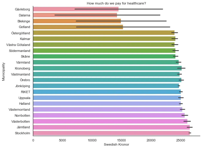
On this page, you will find all the data visualization in Python tutorials on this site. They are mainly using packages such as Pandas, Matplotlib, Seaborn, ggplot, and plotnine. Here you will find tutorials on a range of different plotting techniques such as bar graphs, line plots, scatter plots, histograms, and many more.
Seaborn Tutorials
In this section, you will find all tutorials using Seaborn (and matplotlib) to visualize data in Python.
Python Data Visualization Examples
In the post 9 data visualization techniques, you need to know in Python 3, you will see 9 data visualization examples. Specifically, you will learn about a range of cool ways to display your data. For example, you will learn how to do violin and raincloud plots as well as the usual bar graphs, time series plots, histograms. Note, recently you can also see all these data visualization examples and how to carry them out in Python in a YouTube video. This video is less detailed, however.
More Specific Plotting Tutorials
Learn how to make scatter plots in Python using Seaborn. In this post, you will learn all you need, basically, about creating scatter plots using Seaborn. For instance, you will learn how to change the ticks, axis, size of the dots, among many other things. Make sure you check it out because you will also learn to save Seaborn plots as high-resolution images., If that is not enough, you can also learn how to change the size of your Seaborn plots.

- If you are planning on using your Python data visualizations in a journal paper you need to save the Seaborn plots as high-resolution images. To do this you can use the savefig method from matplotlib pyplot. Now, this will enable you to save the Seaborn figures in formats such as TIFF, PDF, SVG, and EPS.
- It’s also possible, of course, to plot the relation of one variable (or multiple variables) over time with Python. In the post, about Seaborn line plots, you will learn how to create e.g. time series plots.
- Bar plots are, in general, and in some opinion, not conveying enough information. You can create a violin plot in Python using e.g. Seaborn and Matplotlib