With the ever-increasing volume of data, it is impossible to tell stories without visualizations. Data visualization is an art of how to turn numbers into useful knowledge. Using Python we can learn how to create data visualizations and present data in Python using the Seaborn package.
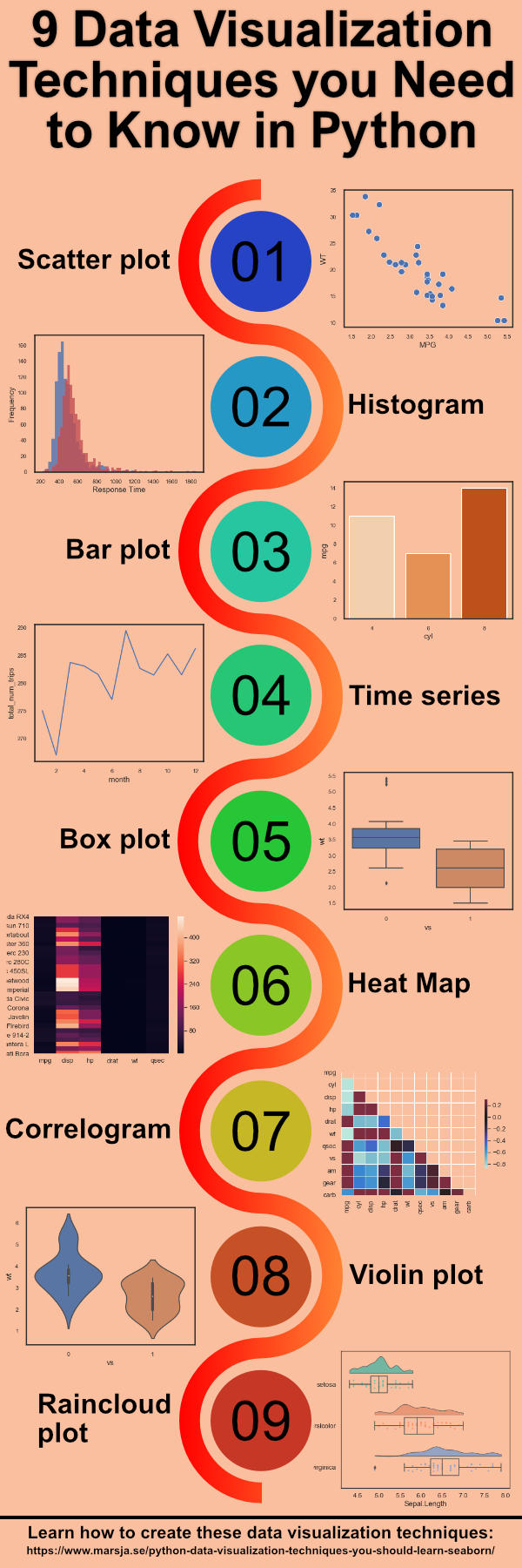
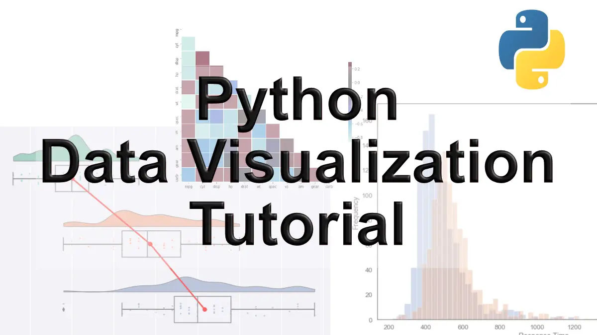
In this post we are going to learn how to create the following 9 plots:
- Scatter Plot
- Histogram
- Bar Plot
- Time Series Plot
- Box Plot
- Heat Map
- Correlogram
- Violin Plot
- Raincloud Plot
In the next section, before we get into the Python data visualization examples, you will learn about the package we will use to create the plots.
Table of Contents
- Python Data Visualization Tutorial: Seaborn
- Installing Seaborn
- How to Install ptitprince
- Scatter Plot in Python using Seaborn
- Histogram in Python using Seaborn
- Bar Plots in Python using Seaborn
- Time Series Plots using Seaborn
- Box Plots in Python using Seaborn
- Heat Map in Python using Seaborn
- Correlogram in Python
- Violin Plots in Python using Seaborn
- Raincloud Plots in Python using ptitprince
- Summary
- References
Python Data Visualization Tutorial: Seaborn
As previously mentioned in this Python Data Visualization tutorial we are mainly going to use Seaborn but also Pandas, and Numpy. However, to create the Raincloud Plot we are going to have to use the Python package ptitprince.
Installing Seaborn
Before we continue with this Python plotting tutorial we are going to deal with how to install the needed libraries. One of the most convenient methods to install Seaborn, and it’s dependencies, is to install the Python distribution Anaconda. This will give you many useful Python libraries for doing data science (e.g., Numpy, SciPy, Matplotlib, Seaborn).
How to Install Seaborn using Pip
pip install seabornCode language: Bash (bash)How to Install ptitprince
In the last Python data visualization example, we are going to use a Python package called ptitprince. This package can be installed using Pip (as this post is written, it’s not available to install using Anacondas package manager conda):
pip install ptitprinceCode language: Bash (bash)Learn more about installing, using, and upgrading Python packages in the more recent posts. For instance, the post about using pipx to install packages directly to virtual environment may prove useful. Moreover, the post about how to install Python packages using conda and pip is also very handy. Finally, sometimes when we use pip to install Python packages we may become aware that we need to update pip to the latest version. This can be done using pip itself. Here’s a YouTube video showing all the 9 Python Data Visualization Examples found in this post. Note, however, that the blog post explains everything in more detail.
Scatter Plot in Python using Seaborn
Scatter plots are similar to line graphs. That is we use the horizontal and vertical axes to visualize data points. However, the aim is different; Scatter plots can reveal how much one variable is affected by another (e.g., correlation).
Scatter plots usually consist of a large body of data. The closer the data points come when plotted to make a straight line, the higher the correlation between the two variables, or the stronger the relationship.
In the first Python data visualization example we are going to create a simple scatter plot. As previously mentioned we are going to use Seaborn to create the scatter plot.
Note, it should be possible to run each code chunk by its own. Note, however, that some code lines are optional. For instance, %matplotlib inline is used to display the plots within the Jupyter Notebook and plt (imported from matplotlib.pyplot) is used to change the size of the figures.
Python Scatter Plot Example:
In the first Python data visualization example, we are going to create a scatter plot:
%matplotlib inline

import matplotlib.pyplot as plt
import pandas as pd
import seaborn as sns

# Suppress warnings
import warnings
warnings.filterwarnings('ignore')

# Optional but changes the figure size
fig = plt.figure(figsize=(12, 8))

df = pd.read_csv('https://vincentarelbundock.github.io/Rdatasets/csv/datasets/mtcars.csv')

ax = sns.regplot(x="wt", y="mpg", data=df)Code language: Python (python)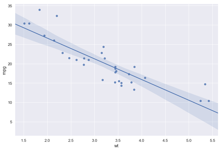
In all examples in this Python data visualization tutorial, we use Pandas to read data from CSV files. More on working with Pandas and CSV files can be found in the blog post “Pandas Read CSV Tutorial“.
- How to Make a Scatter Plot in Python using Seaborn
- Pair plots, containing scatter plots, can be created with Pandas scatter_matrix method.
Changing the Labels on a Seaborn Plot
In the next Python data visualization example, we are going to learn how to configure the Seaborn plot a bit. First, we are going to remove the confidence interval but we are also going to change the labels on the x-axis and y-axis.
import pandas as pd
import seaborn as sns

fig = plt.figure(figsize=(12, 8))
ax = sns.regplot(x="wt", y="mpg", ci=False, data=df)
ax.set(xlabel='MPG', ylabel='WT')Code language: Python (python)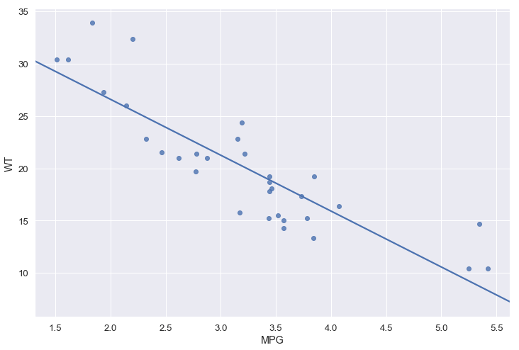
For more about scatter plots:
- How to make Scatter Plots in Python (YouTube Video)
- Exploratory Data Analysis with Pandas Scipy and Seaborn
Histogram in Python using Seaborn
A histogram is a data visualization technique that lets us discover, and show, the distribution (shape) of continuous data. Furthermore, histograms enable the inspection of the data for its underlying distribution (e.g., normal distribution), outliers, skewness, and so on.
Python Histogram Example
In the next Python data visualization example, we will create histograms. Histograms are fairly easy to create using Seaborn. In the first Seaborn histogram example, we have turned set the parameter kde to false. This so that we only get the histogram.
import pandas as pd
import seaborn as sns

df = pd.read_csv('https://vincentarelbundock.github.io/Rdatasets/csv/datasets/airquality.csv')

fig = plt.figure(figsize=(12, 8))
sns.distplot(df.Temp, kde=False)Code language: Python (python)
Now it is, of course, also possible to learn how to plot a histogram with Pandas. Hint: just type df.hist().
Grouped Histogram in Seaborn
If we want to plot the distribution of two conditions on the same Seaborn plot (i.e., create a grouped histogram using Seaborn) we first have to subset the data. In the histogram example below we loop through each condition (i.e., the categories in the data we want to visualize).
In the loop, we will subset the data and then we use Sebaorn distplot and create the histograms. Finally, we change the x- and y-axis labels using Seaborn set.
import pandas as pd
import seaborn as sns

df = pd.read_csv('https://raw.githubusercontent.com/marsja/jupyter/master/flanks.csv',
                 index_col=0)

fig = plt.figure(figsize=(12, 8))
for condition in df.TrialType.unique():
    cond_data = df[(df.TrialType == condition)]
    ax = sns.distplot(cond_data.RT, kde=False)

ax.set(xlabel='Response Time', ylabel='Frequency')Code language: Python (python)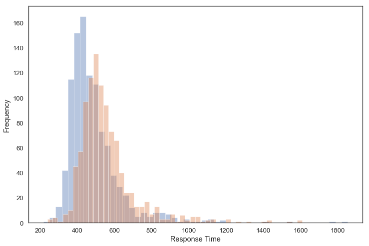
Bar Plots in Python using Seaborn
Bar plots (or “bar graphs”) are a type of data visualization that is used to display and compare the number, frequency or other measures (e.g. mean) for different discrete categories of data. This is probably one of the most common ways to visualize data. Of course, like many of the common plots, there are many ways to create bar plots in Python (e.g., with Pandas barplot method).
Bar plots also offer some flexibility. That is, there are several variations of the standard bar plot including horizontal bar plots, grouped or component plots, and stacked bar plots.
Seaborn Bar Plot Example
In this example, we are starting by using Pandas groupby to group the data by “cyl” column. After we have done that we create a bar plot using Seaborn.
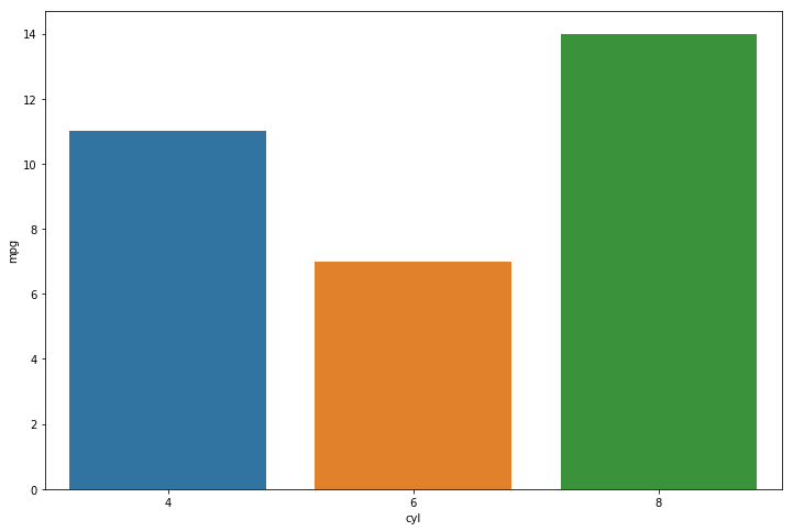
Here’s how to create the above bar plot in Python using Pandas and Seaborn:
import pandas as pd
import seaborn as sns

df = pd.read_csv('https://vincentarelbundock.github.io/Rdatasets/csv/datasets/mtcars.csv', index_col=0)

df_grpd = df.groupby("cyl").count().reset_index()

fig = plt.figure(figsize=(12, 8))
sns.barplot(x="cyl", y="mpg", data=df_grpd)Code language: Python (python)
More on how to work with Pandas groupby method:
Setting the Labels of a Seaborn Bar Plot
When displaying data in Python it, of course, makes sense to be as clear as possible. As you can see in the figure
In the next example, we are going to change labels because the y-axis actually represents the count of cars in each cylinder category:
import pandas as pd
import seaborn as sns

df = pd.read_csv('https://vincentarelbundock.github.io/Rdatasets/csv/datasets/mtcars.csv', index_col=0)

df_grpd = df.groupby("cyl").count().reset_index()

fig = plt.figure(figsize=(12, 8))
ax = sns.barplot(x="cyl", y="mpg", data=df_grpd)
ax.set(xlabel='Cylinders', ylabel='Number of Cars for Each Cylinder')Code language: Python (python)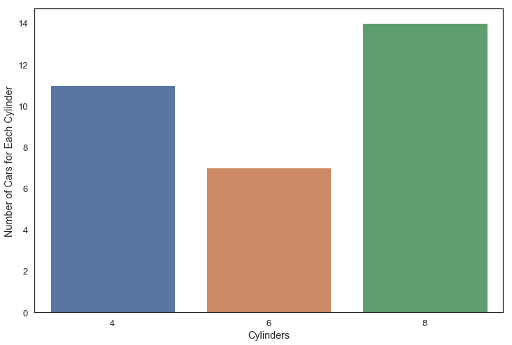
Note, there might be better ways to display your data than using bar plots. Some researchers have named bar plots “dynamite plots” or “barbar plots”. This because when visualizing the mean, you might miss the distribution of the data (e.g., see Weissgerber et al., 2015).
Time Series Plots using Seaborn
A time series plot (also known as a time series graph or timeplot) is used to visualize values against time. In the Python Time Series Plot example, below, we are going to plot number of train trips each month.
import pandas as pd
import seaborn as sns

df = pd.read_csv("https://raw.githubusercontent.com/rfordatascience/tidytuesday/master/data/2019/2019-02-26/full_trains.csv")

fig = plt.figure(figsize=(12, 8))
sns.lineplot(x="month", y="total_num_trips", hue="departure_station",
             ci=None, data=df[df.departure_station.str.contains('PARIS')])Code language: Python (python)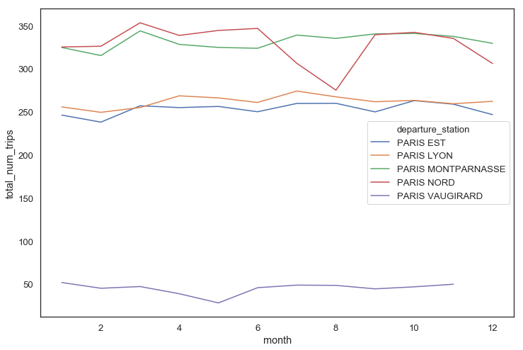
See the more recent post about data visualization in Python and how to make a Seaborn line plots. Now, it’s also possible to make a column index in the Pandas dataframe and use it when visualizing time series data.
Box Plots in Python using Seaborn
In the next examples, we are going to learn how to visualize data, in python, by creating box plots using Seaborn. A Box Plot is a data visualization technique that is a little better compared to bar plots, for instance. Box Plots will visualize the median, the minimum, the maximum, as well as the first and fourth quartiles. Any potential outliers will also be apparent in the plot (see image below, for instance).
Python Box Plot Example
Here’s how to create a simple box plot in Python using Pandas and Seaborn:
import pandas as pd
import seaborn as sns

df = pd.read_csv('https://vincentarelbundock.github.io/Rdatasets/csv/datasets/mtcars.csv', index_col=0)

fig = plt.figure(figsize=(12, 8))
sns.boxplot(x="vs", y='wt', data=df)Code language: Python (python)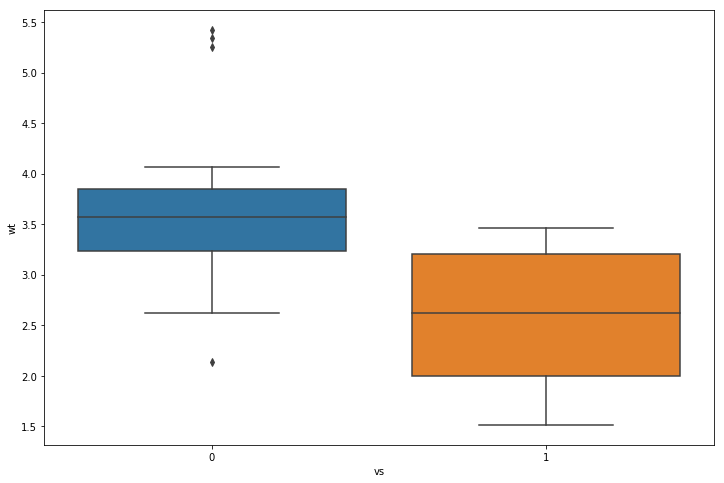
Heat Map in Python using Seaborn
A heat map (or heatmap) is a data visualization technique where the individual values contained in a matrix (or dataframe) are represented as color. In the Seaborn heat map example, below, we are going to select a few of the columns from the mtcars dataset to create a heat map plot.
import pandas as pd
import seaborn as sns

df = pd.read_csv('https://vincentarelbundock.github.io/Rdatasets/csv/datasets/mtcars.csv', index_col=0)

fig = plt.figure(figsize=(12, 8))
ax = sns.heatmap(df[['mpg', 'disp', 'hp', 'drat', 'wt', 'qsec']])Code language: Python (python)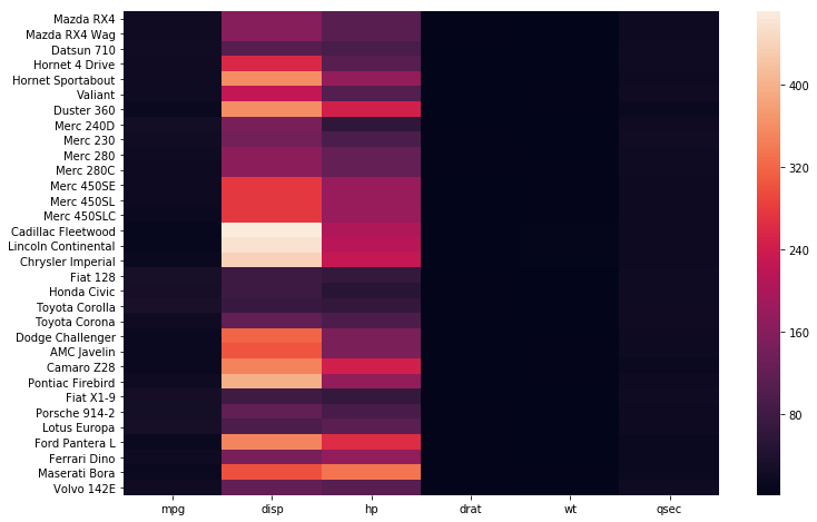
In the next Python data visualization example, we are going to cerate a correlogram with Seaborn.
Correlogram in Python
We continue with a Python data visualization example in which we are going to use the heatmap method to create a correlation plot. Note, a correlogram is a way to visualize the correlation matrix. Before we create the correlogram, using Seaborn, we use Pandas corr method to create a correlation matrix. We are then using numpy to remove to the upper half of the correlation matrix.
import numpy as np

corr = df.corr()

mask = np.triu(np.ones_like(corr, dtype=bool))


sns.heatmap(corr, mask=mask, center=0,
            square=True,)Code language: Python (python)
Now, if we just want to look at the coefficients, or use the data in a report, we can also create a correlation matrix in Python using NumPy or Pandas.
Violin Plots in Python using Seaborn
In the next Python data visualization example, we are going to learn how to create a violin plot using Seaborn. A violin plot can be used to display the distribution of the data and its probability density. Furthermore, we get a visualization of the mean of the data (white dot in the center of the box plot, in the image below).
import pandas as pd
import seaborn as sns


df = pd.read_csv('https://vincentarelbundock.github.io/Rdatasets/csv/datasets/mtcars.csv', index_col=0)

sns.violinplot(x="vs", y='wt', data=df)Code language: Python (python)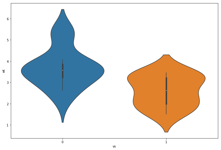
For more about data visualization see the post How to Make a Violin plot in Python using Matplotlib and Seaborn
Raincloud Plots in Python using ptitprince
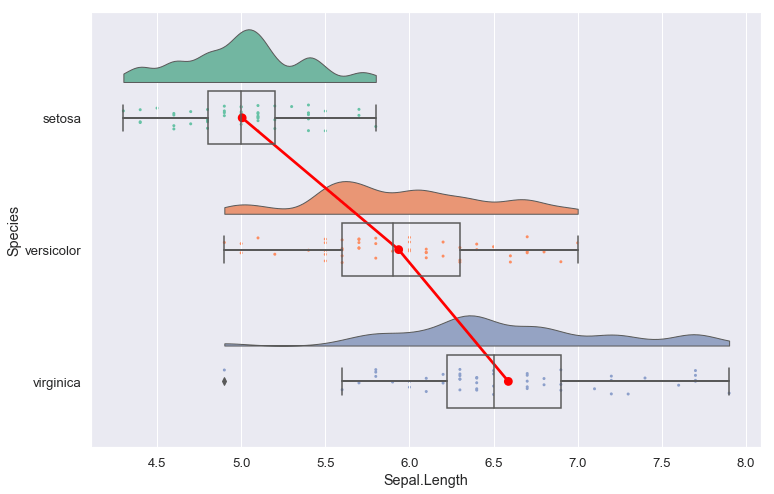
Finally, we are going to learn how to create a “Raincloud Plot” in Python. As mentioned in the beginning of the post we need to install the package ptitprince to create this data visualization (pip install ptitprince).
Now you may wonder what a Raincloud Plot is? This is a very informative method to display your raw data (remember, bar plots may not be the best method). A Raincloud Plot combines the boxplot, violin plot, and the scatter plot.
Python Raincloud Plots Example:
Here’s how to create a Raincloud plot in Python using Pandas and ptitprince:
import pandas as pd
import ptitprince as pt

df = pd.read_csv('https://vincentarelbundock.github.io/Rdatasets/csv/datasets/iris.csv')

ax = pt.RainCloud(x = 'Species', y = 'Sepal.Length',
                  data = df,
                  width_viol = .8,
                  width_box = .4,
                  figsize = (12, 8), orient = 'h',
                  move = .0)Code language: JavaScript (javascript)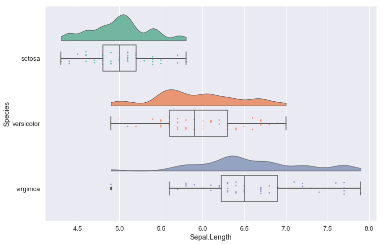
Learn more about how to change the size of the Seaborn plots in Python.
Raincloud Plots in Python Video:
Here’s a YouTube video showing how to install ptitprince and how to create the two raincloud plots in this post:
If we need to save the plots, that we have created in Python, we can use matplotlibs pyplot.savefig method. In a recent post, we learn how to specifically save Seaborn plots as PDF, SVG, EPS, PNG, and TIFF files.
Summary
In this Python data visualization tutorial, we have learned how to create 9 different plots using Python Seaborn. More precisely we have used Python to create a scatter plot, histogram, bar plot, time series plot, box plot, heat map, correlogram, violin plot, and raincloud plot. All these data visualization techniques can be useful to explore and display your data before carrying on with the parametric data analysis. They are also very handy for visualizing data so that other researchers can get some information about different aspects of your data.
Leave a comment below if there are any data visualization methods that we need to cover in more detail. Here’s a link to a Jupyter notebook containing all the 9 Python data visualization examples covered in this post.
References
Allen M, Poggiali D, Whitaker K et al. Raincloud plots: a multi-platform tool for robust data visualization [version 1; peer review: 2 approved]. Wellcome Open Res 2019, 4:63. https://doi.org/10.12688/wellcomeopenres.15191.1)
Weissgerber TL, Milic NM, Winham SJ, Garovic VD (2015) Beyond Bar and Line Graphs: Time for a New Data Presentation Paradigm. PLOS Biology 13(4): e1002128. https://doi.org/10.1371/journal.pbio.1002128
Excellente article
Thank you, Atil. Glad you liked it.
Thanks Eric.!
That’s usefull for better programming.
Hey Jacques! Thanks for your comment, glad you liked it.
“Python Rainclod Plot Example” – is that a spelling mistake?
Hi Derek,
Yes, of course it should say “Python Raincloud Plots Example”. Thank you for pointing this out.
Best Regards,
Erik